
Our previous platform release brought a number of improvements to our Data Explorer, and as promised, we've ported many of those enhancements over to our dashboard graphs. Chief among these is the ability to define a different graph type for each segment, making for more legible and engaging time series graphs.
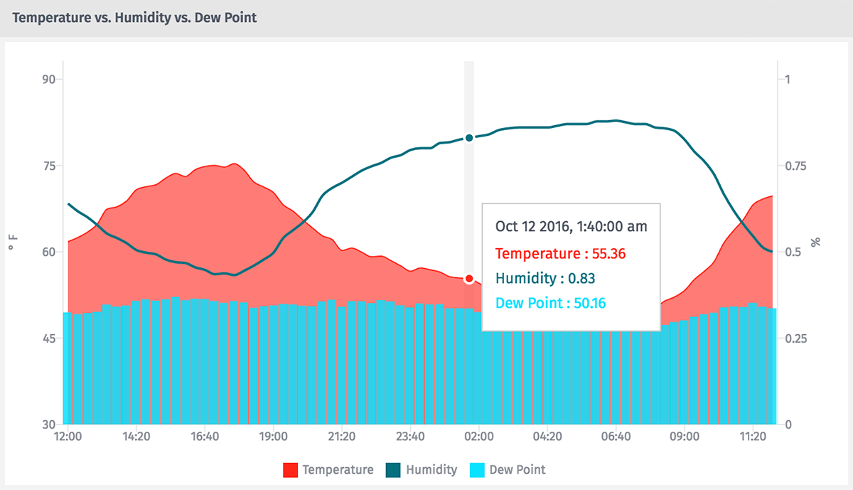
Not only can we now combine lines, area charts and bar graphs in one time series block; we can now view the data for all segments at a given point in time where we once had to hover over each line separately.
Conditional Gauge Blocks
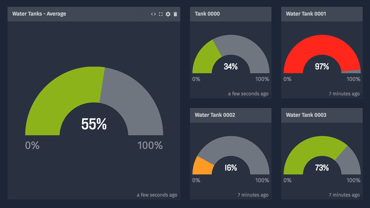
We've brought the rules engine from our indicator blocks into our dashboard gauge blocks, allowing dial gauges to change color based on the block's current value. For example, if you're measuring the water level of a tank, you can display the gauge as red only when levels are too low (or too high!).
Everything Else
We fixed a few bugs and made some other platform improvements in this release as well:
Other Graph Changes
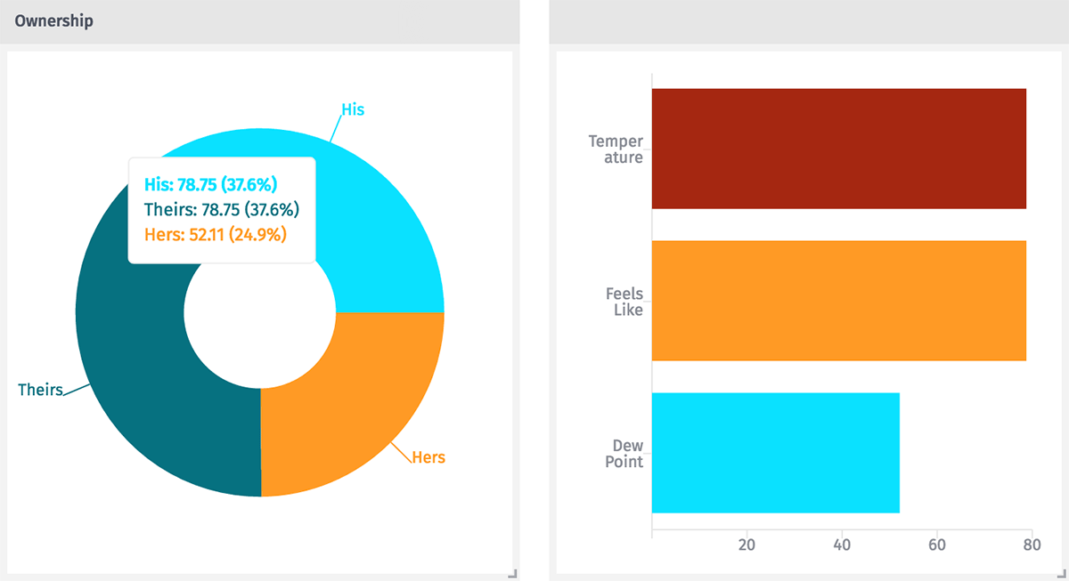
The changes are subtle, but we've moved our pie graphs and bar charts to a D3.js-based graphing library. The most noticeable difference is that pie segments are now identified by a label pointing directly to the segment instead of having a separate legend. More importantly, moving to this new library opens the door to future enhancements.
Payload Access - Consistency Improvements
We've improved validation and streamlined the formats our platform accepts when getting or setting payload data. In conjunction with that, we've rolled out some much better documentation on how to use these features throughout the platform, including a comprehensive list of all operators and Handlebars helpers we currently support.
Console Available in Function Nodes
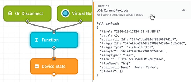
In our workflow function node, you now have access to the JavaScript console object. Output appears in the debug panel, along with the workflow's payload at the time of evaluation. (Great suggestion, Adam_Daniel!)
Helpers for All!
Handlebars helpers can now be used with any string template or expression, no matter the context. This brings newfound formatting power to a number of dashboard blocks and workflow nodes.
Bug Fixes

- Indicators and gauges now allow for text to scroll within the block. (We've got your use case covered, rorpage!)
- Data table default sorting now works on the left-most column. (Sorry about that, Dillon1337!)
- Virtual buttons within cloned workflows no longer fire the corresponding virtual button in the original workflow. (Good catch, Bob_Gelety!)
What's Next?
With every new release, we really listen to your feedback. By combining your suggestions with our roadmap, we can continue to make the platform easy for you. Let us know what you think in the Losant Forums.