
When we released the Data Explorer about six weeks ago, we knew it was just the first iteration of an engaging (and complex) experience. Now, after some feedback from our users, a little internal brainstorming and a lot of elbow grease, we're proud to bring you Data Explorer v2.0: Faster! Sleeker! Data Explorerier!
What's New!
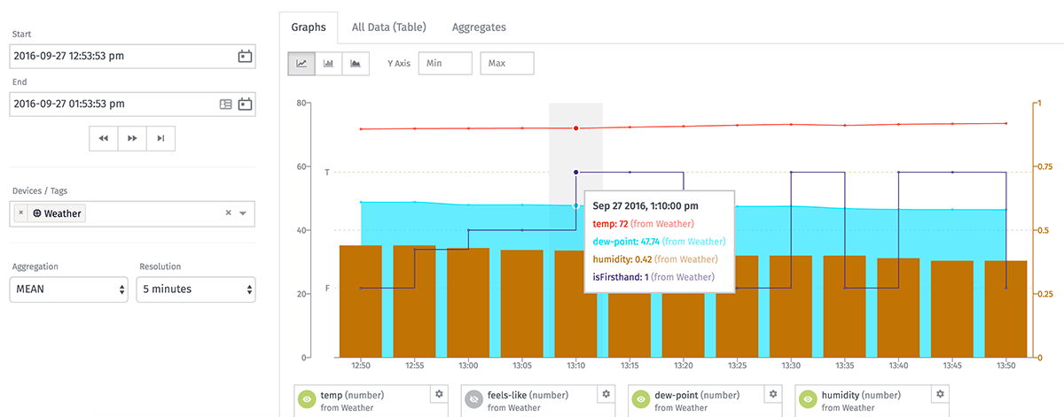
The Data Explorer still allows users to view historical data for a selection of devices and attributes across a defined time range, aggregation method and resolution. In this release, we've expanded upon that functionality and added a few new features:
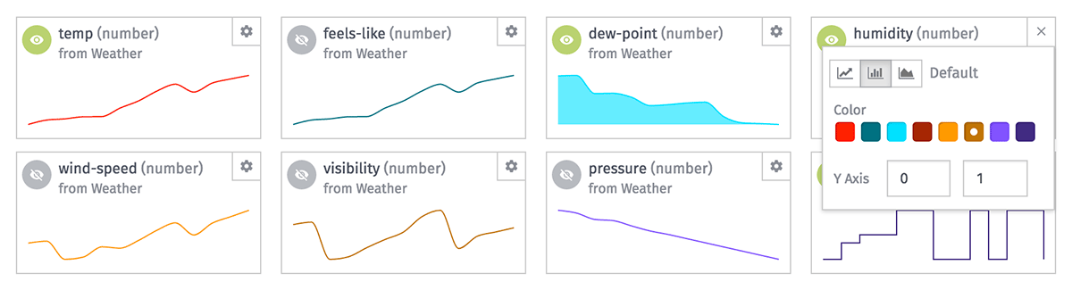
- All graphable attributes now display sparklines, which you can then choose to display in detail in the main graph. This allows you to view everything at a glance before deciding if it's necessary to dive in for a closer look.
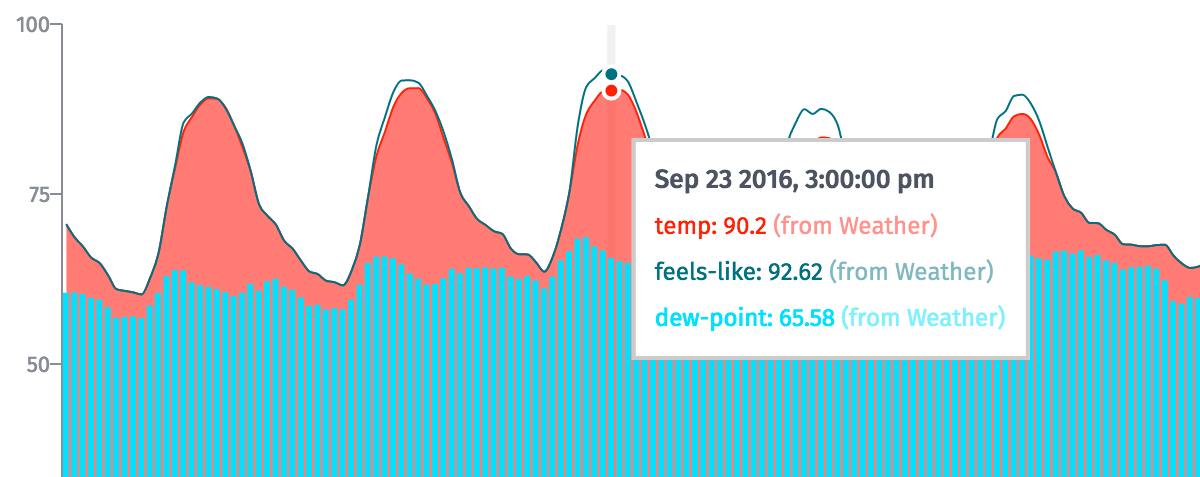
- Each attribute can now have its own graph style, Y Axis domain and color. View one attribute as a line graph, another as a bar chart and a third as an area chart. And each attribute can be scaled appropriately to view proper correlations.
- You can now query devices by tag. Doing so will return all individual devices (and their attributes) that match the tag.
- All attribute types can now be viewed in the Data Explorer. Previously, the feature only supported number attributes.*
- We've added a "Jump to Now" button that will change your time range to "Now minus the current duration."
- There are two new aggregation methods available: "FIRST" and "LAST", which will return the first and last data points reported by the device for each attribute in the resolution period.
* Boolean attributes will graph in a special format for all aggregation methods other than COUNT and SUM. String and GPS attributes can only be graphed against COUNT aggregations, and they will only return table data against COUNT, FIRST and LAST aggregations.
What's Improved!
- We've switched to a new charting library that is far more performant – and which also allowed us to add some of the features listed above. The library is based on the popular D3.js framework, which opens up more possibilities for future enhancements.
- Tooltips now respond to mouse movements over points in time, instead of points on a single line, meaning that the data for each line being graphed is visible within the tooltip at once.
- We've gotten better about loading data on demand, which has made for a snappier experience overall. No more fetching hundreds of data points for attributes you have no intention of ever viewing.
- Data tables are also much quicker to load, sort and peruse, and they now render in a way that will not lock up the browser when thousands of rows are present.
- As a performance failsafe, we now throw a message to the user to pare down their request when attempting to graph more data than the browser can handle.
What Else?
Data Explorer v2 is the lion's share of this release, but we are still rolling out a handful of other features today:
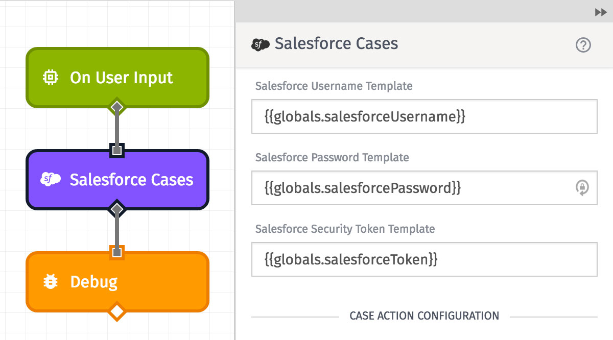
- We've added a Salesforce Cases node in our Workflow Editor. It's now possible to connect to the Salesforce Service Cloud from Losant and find, create or update cases.
- In the Workflow Editor, now you can hover over a message in the Debug panel and the node that generated the message will highlight, making it easier to hunt down errors and follow your flow's branches.
- Trigger nodes in the Workflow Editor now include an example payload. Knowing what to expect at the start of the flow path will help users correctly build out their workflow branches beneath the trigger.
- If you've ever made changes to a workflow and tried to fire a virtual button before saving your changes (I know I have), you've probably experienced some unexpected results. Now, we're disabling virtual button presses when workflows are in an unsaved state.
- Incoming webhook requests now appear in the Application Debug log.
What's Next?
We're hard at work on our next platform release, and some of the coming changes come directly from our user suggestions.
- We'll eventually add map support to the Data Explorer, so you can view GPS History and Heatmap data over a historical period much like you can in our dashboards.
- Many of these new Data Explorer features and performance improvements are coming to our dashboard blocks – for example, the mixing of chart types in a single block.
- We've gotten a few requests for real-time data visualizations in the platform. We hear you, and we're working on it.
With every new release, we really listen to your feedback. By combining your suggestions with our roadmap, we can continue to make the platform easy for you. Let us know what you think in the Losant Forums.